Friday, 11 May 2012

Post 19d

Evaluation Questions and Tasks

Question 4 - How did you use new media technologies in the construction and research, planning and evaluation stages?

What is new media technologies?
'We define "new media" as interactive forms of communication that use the Internet, including podcasts, RSS feeds, social networks, text messaging, blogs, wikis, virtual worlds and more!
New media makes it possible for anyone to create, modify, and share content and share it with others, using relatively simple tools that are often free or inexpensive. New media requires a computer or mobile device with Internet access'. - (follow this link to find source)

'New media is a catch-all term for all forms of electronic communication that have appeared or will appear since the original mainly text-and-static picture forms of online communication'. - (follow this link to find source)

Below is an image of all of the new media technology I used when creating my media product. I have used a montage of images as well as annotations to show the new media technologies I have used and for what purpose.


1) Blogger - Blogger is classed as a new media technology and is an online website where you are able to sign up and post blogs on a topic of your choice, from media work to a general day to day use. Blogger is one of the most important and well used media technology I have use throughout the course. It works as an online portfolio working with other programs like 'YouTube' as a platform for us to show our media work. Blogger allows us to edit, add and delete parts of our work easily. With the easy use of being able to link your work, add photos, videos, links, sound clips and drafting your work before posting it and even being able to edit the HTML coding yourself. All of my work displayed on this software has been put onto my blog using these techniques. Blogger is an easy to access site and very efficient. This site was very useful throughout AS and A2 media and the coursework would have been significantly difficult if we didn't have blogger. The ability to write the coursework on this software makes it easier to do in an IT advanced society.

2) Photoshop - Photoshop is the programme where I have edited all the images I needed within my A2, the software is very complex but we are able to find out any instructions about it on the internet. This was very helpful for me as before A2 media I had never used photoshop before so I had to learn the basics before I could start. Although it took me quite a lot of time to understand it and become fluent when using it, I consider it to be a useful software to use as gives you the best quality product. I used this software mostly when creating my postcard front and back and my film review. Using photoshop has been very effective when creating my postcard and film review. It helped me to manipulate images to create a great effect. 

3) Canon 550D - This new media technology was crucial when looking at the pratical side to my coursework. With the use of my camera as well as the teachers camera my coursework could have suffered. I used it to take photos for my postcard and my film review. I also used it to take pictures when we were filming this was so we could use these as evidence as well as using them to make my blog more visual through the pre-production, production and post-production. I also used the camera to take photos for the location reeces in the pre-production stage. The camera was a vital piece of equipment within my media production, the shots taken were a high quality due to how advanced the camera was. Without the camera it would have been difficult to take photos for my postcard to a high standard and quality.    

4) Adobe Premiere Pro - This new media technology was provided by the school and the software that we used to edit all of our media products. I used this software to capture, create a rough cut, and edit both the visuals and the audio. This software was easily laid out with useful tools and effects to make Adobe Premier Pro the ideal programme for us to use. Without the use of Adobe Premier Pro the editing process of our project would have been more difficult. Adobe Premier Pro gives off a high quality product which is not found in many other editing softwares.  

5) Internet Explorer -  I used this new media technology to do my research throughout the process of pre-production, production and post-production. Internet Explorer was a useful software when looking at trying to research into background information as well as looking for visuals. Without this software I would have struggled to find out things I didn't understand or look up defintions from other people on a media term.

6) Wikepedia - This software enabled me to research from a well-known source into any information or topic I needed to know. It provided me with information throughout the course from information of certain films, media technologies and rules that are set when filming like the 180 degree rule. Wikepedia was a very useful website as it was able to give me information on nearly every topic. Without this website I would of needed to use other search engines to find the information needed.

7) Copyright free music channel - This new media technology was used mainly in the post-production stage. I used this software mainly to find uncopyrighted music to put at the start and end of my film. This was one of the most vital pieces within the A2 course. As we were not able to use uncopyrighted music of a high quality we were recommended to use this website by our school so we could find uncopyrighted music of a high quality and from a reliable source. This website had different audio tracks that were uncopyrighted from a variety of genres. Without the use of this website we wouldn't have been able to access music so easily and it would have resulted in us having to pay for uncopyrighted music or we would of had to create our own sounds or as a last resort having to get rid of music altogether which could have significantly reduced the quality of our work.

8) Flip camera -  The flip camera that was provided to us by the school was a piece of new media technology we used. The flip camera enabled us to use different styles when presenting our work. The flip camera was used majorly when gaining our audience feedback, we used this easy, portable camera to video our target audience giving feedback on our film. This was a useful piece of equipment in the pre-production and the evaluation as we were able to collect feedback that we could then evaluate. The flip camera was useful in the sense that I was able to provide more information without having to type it out and also allowed me to gain a higher mark for using different types of IT. If the flip camera was not available to us we would have struggled to make our videos and would of had to use a different type of video camera of a reasonably good quality.

9) PD150 Camera - This piece of equipment is a high definition and quality camera that we used in our A2 pratical section of the coursework to shoot our short film and we felt that having used a lower quality camera last year that the difference was definately noticable and that this year the quality of our project was a lot more advanced in terms of the visual as well as the audio. If we didn't have this camera then we would have struggled to make such a high quality film and would of had to comprimise with the cameras we used last year.

10) YouTube - This new media technology is a widely recognised and highly used website that helped me during the course of media studies in AS as well as A2. It was especially useful when researching into short films in the pre-production as I had never really taken an interest in short films before YouTube helped me to research into the format and layout of short films and how others with a more professional background made their short films and the length as well as the different narratives as well as genres. YouTube is also an important software for the distribution of your film. It helps you to distribute your short film to wider audiences. YouTube also helped not only to gain an understanding of the format of short films as well as the distribution of them. Youtube was also my main software after creating videos as I put them onto YouTube to transfer them onto my blog, to create more visual elements within the coursework. Without the use of YouTube I would have struggled to complete all the tasks explained earlier and to distribute my film I would have needed to have attended short film festivals to get my film widely recognized.

Post 19c

Evaluation Questions and Tasks

Question 3 - What have you learned from your audience feedback?
Short Film

Postcard


Film Review


My responses and reflections on my feedback
I feel that the feedback I got from all three products really helped me to reflect on my products, analysing them on their strengths and weaknesses and how I could change them to make them better and more appealing to my target audience.

The first of my three products I looked at was my short film. One of the popular comments I got from my audience was that some of the acting was poor. Due to the short amount of time we had in the pre-production and production we struggled to find very professional and experienced actors throughout the whole film. We managed to get professional actors for the main characters however due to the limited time limit we felt that it was more important to spend time on the pre production parts like the technical reece's rather than finding professional actors for the whole product as this would be really difficult. Another comment that we recieved was the fact that they felt that the film needed more music throughout I felt that this was a good point. Music is a great way of setting the mood and keeping the audience engaged and if I went back and improved on my film I would defiantely take this point into consideration. One member of my audience that gave feedback didn't like how short it was and felt it could have been developed out. I would take this on board in the future however our aim was to make a short film and therefore I felt that if we had made our film any longer it would not have stuck to its aim. The next comment was the fact the football match didn't look very realistic. I feel that this was true and looking back on my project I would have given the scenes with the football matches a lot more time and organisation. This would have made the football match a lot more realistic as we could have got a lot more players.

The second of my three products that I got feedback from was my postcard for my short film. My audience really like this section out of all of my products. One criticism they did have of my postcard was the amount of text displayed. The audience felt that there was too much and although they liked the fact that it gave out a lot of detail. They felt that for a postcard it needed to be shortened so that they can quickly recognise the important parts of what they needed to know rather than having to try and filter through. If I was to make a postcard again to distribute a short film I would take this into consideration as I feel that as the audience we just want to know the basics so we can get the 'gist' of whether this film is for the individual or not.

The last of my three products that I analysed was my film review. One section of the audience stated that they didn't like the lines at the top of the page as it made it feel tightly packed in and hard to read. I feel that next time to improve I will look into the forrmat of reviews to see if I can space it out more so it is displayed more clearly. The audience also felt it was quite plain and not very eye catching I feel to change this I could add more colour to my review, but sophisticated colours to keep with the style of the review.

Overall I feel that the majority of the audince like my three finished products and the only weaknesses they felt were found were small and only minor points.

Thursday, 10 May 2012

Post 19b

Evaluation Questions and Tasks
Question 2 - How effective is the combination of your main product and ancillary texts?

Below I am going to analyse and compare the similarities of my three products. This includes my short film, postcard and film review. The objective of this is to see how effective the combination of my three tasks is.

Similarity 1

This combination of my short film and ancillary tasks all show a similar common theme coming up of secrecy. My short film is about a young teenage boy who is unsure of his sexuality however by the end of the film he chooses Ashley to be with revealing that he is actually gay. However throughout the film this is kept secret because he knows if it gets out he will lose his status. This links to my review as well because as the highlighted text above displays if the secret gets out it will jeopardize his high status meaning he has to keep this to himself. This is finally shown in the postcard the zip displayed across the image symbolizes that he should keep quiet. This means that all three products link to the theme of secrecy.

Similarity 2
Between the combination of my film review, postcard and short film I have mentioned the cast and crew names. This in my opinion is a very important attribute as not only can they be seen as a USP because we are new to the film industry and therefore our styke if filming is different to others but also these people were very important in the making of the film and therefore should be mentioned.
Similarity 3
 From this image we see that we were very effective in combining the three products. In all three the main character is displayed. This is because the film follows his difficult journey into the discovery of his sexuality. The  film is based around the character of James and therefore he is the main central point to all three of my products as this reflects what the film is about.
Similarity 4
I was also effective in combining the products in terms of the hidden feminine aspects that give the audience little hints into James' real sexuality. In the film we have put in little hints and symbols that are stereotypically linked to femininity, for example the purple flower seen in the screenshot above. This was also mentioned in the film review to give the audience little hints. The final product this is found in is the postcard. I have used this idea of hidden femininity in my title where I have used a pink. This gives the audience little hints but cant however guess what it is. It is also found in the postcard with the heart zip as hearts are also seen as a sign of femininity.


Post 19a

Evaluation Questions and Tasks

Question 1 - In what ways does your media product use, develop or challenge forms and conventions of real media products?

Once all my media products were finished, the short film, postcard and film review I then looked at whether my work developed or challenged forms and conventions of real media products.

My Film


1. The first screenshot shows the title of our film which is the first image the audience will see when they watch our film. This develops conventions as it is found regularly in short films, for example in the short film Late Bloomer, the link for the video is shown below:
Late Bloomer
It is common for short films to begin with the title of the film and I have therefore stuck to this convention. In some ways I like this layout with the title at the beginning as it can give the audience clues to what the film is about through the title and is a nice way into leaading the audience into the opening of a film and giving clues into whats to come.

2. The second screenshot is of our crew names, this is also a convention of films, which I found in my research last year when looking at title sequences. These crew names in our case and also in other films are at the beginning of our film after the title these are our USP, as we are almost 'new to the business', audiences will not have seen a film made by this crew and therefore will not have seen the style or techniques that our crew have used making it different and unique.

3. The third screenshot from our short film is the first shot we see from the film, it is an establishing shot of James. Having the first shot of the film being the main character is very conventional, this gives the audience a clear welcoming into the film and establishes the audience with the main character to give them a nice, clear opening.

4. Throughout our film we have chosen to use text messaging. In the short films I have watched during my research I have not seen this, however from other research and previous knowledge, tackling social issues are usually caused through cyber bullying and this is what I wanted to portray when looking at my short film. Teenagers at school tend to communicate mainly through text and to portray their age group we used text to do this, we also felt that putting these questions to James through text also makes who they are hidden, this helped us to enforce the fact that the audience didn't know who Ashley really was. This therefore meant that to my knowledge texts broke the conventions of our film.

5. The fifth shot from our film shows an estblishing shot of James' girlfriend. In the genre of film we chose to use, the girlfriend is prominent and a major part to the film. In this respect we therefore did stick to the conventions. To also highlight her importance we chose to dress her in red as this symbolises lust and also danger. The danger is a minor hint to show something is not quite right between James and Roxanne and is a hint to show that he shouldn't be with Roxanne but with Ashley.

6. This shot also enforces Emily's character.However this breaks conventions as we see Emily from the first instance as a horrible character and not one that James should really be with. They are not seen as a happy couple, more of one that is they use as a convienence to holding on to their high status.       

7. This shot is immediately after we see the revalation of Roxanne's character and this then straight away shows the caring and nice character of James as he picks uo the young childs books after Roxanne purposely knocks them out of his hands. James being the likeable character compared to Roxanne who the audience shouldn't like. This then leads the audience into being satisfied with the ending as the audience should find Ashley and James more of a likeable couple to James and Roxanne.

8. This shot is not a convention of our genre of film however it does link to the title of our film. Football is the main item that gives James his status and this shot that is shown in the screengrab shows James very engaged in the match we see James popularity through this, we see his confidence and we see the dilemma he has as he will lose this if he chooses Ashley over Roxanne.

9.  This in my opinion is a very shocking scene within our film but however is almost a convention as well as a sterotype. This is a very prominent image that looks at the outcome of some of these issues found in society. This is a very gripping image and can target the audience to show them the outcome of somes actions and can teach the auience a moral lesson. From this part of the media product we can see that it sticks to conventions because it teaches the audience moral lessons and has a purposeful meaning behind the film which I found when I researched into other short films that had been made.

10. This image gives off a similar message to the one above. It looks at the socio-realist idea of bullying which happens to lots of people in their life. This image again is a convention as it looks at these issues and gives across a moral message that this is wrong which is found within many other films I have watched. 

11. This is an image where the sound was dropped out which we were influenced by Jon-Luke Goddard. This usually isn't conventional in short films and many directors haven't used this however we felt that this was worked really well in this part of the film as it shows James shutting Roxanne out. This is another minor hint to show James is not interested, he has other things on his mind.

12. This image is very stereotypical and prominent and is very common in the genre of film we have used. It also shows a lot about the character of James as well. This is because it shows his character to be easily influenced and someone who will just stick to their comfort zone.

13. This is the second time when we see James in goal however again we see the sound dropped. This again has the same effect as before and shows that in this second football match he is not concentrating he is distracted. This is not usually conventional in films however has a purpose within our film.

14. This shot shows a football match. This is not conventional within these types of films but however is used as a symbol to show James' masculinity. Football is his comfort zone and what gives him his 'Status'. Rather than a convention this is a symbol to show his masculinity to take away the audience realisation of the twist.

15. This is a prominent image at the end of our film and finishes it off nicely. This shot within the film is very conventional of the genre of film and also in a lot of short films as well as mainstream films that I have watched they tend to end with a prominent image. One that will leave the audience satisfied. From my research however it is known that American films tend to leave the audience in a happy state whereas British films tend to be more troubling and finish on a sad note. An example of this is in the film 'The Vanishing' where in the British version the woman dies whereas in the American version the woman survives and we have a happy ending. In our film and especially in this shot we wanted to leave our audience satisfied and in this sense we broke conventions as our aim was to produce a short British film but instead of giving it a sad ending we left the saudience satisfied that it was James and Joel that were together.

16. This is very coventional of films and especially short films, this creates a nice ending giving credit to all the actors involved and showing the audience which actors played their parts. In most short films and also other longer films I have watched their are rolling credits at the end of the film to finish it off.

My Postcard
My Film Review

Tuesday, 8 May 2012

Post 18

Final Products

Short film 'Status'
Postcard for my film


Film Review
Words for the review

New to the business, director Kelly Brown introduces a heartwarming short film focusing on tackling controversial issues found within the local communities across 21st century England. Set in the filmic style of Jean Luke Goddard and French New Wave, Status looks at James, a student found in the heart of Kings Langley. Still at school we see him struggling to find out who he really is and what he wants in life. Faced with a series of questions and the choice of several paths to take with a sequence of scenarios, we will trace his journey as he has to make difficult choices and decisions that could change his life forever.
James, one of the ‘lads’ has a difficult journey, having to choose between following his heart or succumbing to the pressures of society.  James seemingly has it all, popularity, looks, money, a car, he is dating the most popular girl in school and he is the captain of his school’s football team. However, things aren’t always as they seem. An underlying conflict threatens his eminent status. The major twist within the plot grasps the audience’s attentionfrom the onset, and delivers a gripping tale that is sure to leave the audience shocked, with their views on society changed as Status is sure to deliver a performance they are not likely to forget.
With his popularity and reputation at risk, James, struggles through a tough week, trying to make sense of the decisions he knows he cannot avoid. With his girlfriend, Roxanne’s, fiery personality and needy attitude, James decided he has had enough and he finally wants happiness and is willing to sacrifice everything he holds.
Ashley acts as a catalyst, as increasing pressures build on James, as James finally realizes he wants happiness over his status, and is willing to lose it all.
Michael Hale from London commented: Status is a refreshing new film tackling issues facing society today. The gripping plot held me mesmerized from start to finish. The acting was professional and very naturalistic. I was kept on the edge of my seat from start to finish, in anticipation to see how the plot would unfurl, and how James would cope with the emotional conflict he was facing.

Post 17

Post-Production Report

The first step to editing our film after it had all been filmed on the camera was to capture the scenes we needed to edit. To do this we plugged the camera into the editing suite and viewed all our footage. Whilst viewing our footage we then made a logging rushes table where we had to make decisions into what takes of each shot we wanted to keep for our final production. In this table we had the in code, where the clip started, out code, where the clip ends, the scene, shot and take, a description of what happens within that scene and a column to write down whether we wanted that scene or not. Below is the logging rushes table for our short film ‘Status’. After we had finished our table we then had to capture the clips we said we wanted to keep.

Once we had filtered through all our footage so we had left only the scenes that had been captured we then made a rough cut of our film. We went through each captured clip individually cutting it to the parts of the clips we wanted, cutting out unnecessary sounds like ‘action’ or ‘cut’. Once this was done we then added them together creating a rough cut of our film, a simple version to see what our film might look like. Now this was done we ran the whole of our rough cut through looking for continuity issues. Concentrating on the visuals we were able to see whether our short film so far worked. This is the point where we saw the issues mentioned in my production blog post so to make the visuals work we then went to re-film this. Once the re-filmed footage had been through the stages mentioned before and inserted into the rest of the rough cut we then had a basis for our film and the visuals.
This then led to the next stage of the editing process which was to sort out the sound, looking at the sound levels so far of our film. The first stage was to mix the sound of each clip together. This consisted of adding sound dots so we could control sound levels. The main reason for mixing sound when we were editing was so that the film would not only flow in the visuals but also the audio. Once the sound had been mixed we then had the job of making sure the middle parts of each clip had the right sound levels as some clips were a lot louder than others. This just consisted of putting in more sound dots and moving them up down carefully to control the volumes of each clip. We found that because we had not experimented or used a microphone with such sensitivity before, we had a variety of sound issues. Some that consisted of the microphone picking up unwanted background noise and others where the sound just cut off completely. This created more problems when it came to editing as there was unwanted sound that needed to be fixed. However this easily done by controlling levels and using sound from previous takes where the audio has worked really well.
After the visuals and audio had been completed we felt that it was best to get our teacher to look at our film. This is because she can look at it from a professional stand and from her previous experience will be able to spot minor or major mistakes we may have made.  So after we asked her politely, she sat down and watched our ‘draft’ and as she watched it she wrote down some notes about what needed to do to improve our film. One of the main changes she made was the end scene. Originally we wanted to have the camera pan up to the sky. However our teacher felt that this didn’t look as good as our film, so as a group we looked at the effects on the editing and decided to put an effect on our end shot of the hands because we felt that this is one of the most iconic scenes in the last scene. She also said that we needed to think about our transitions between scenes. She asked us what style of film we were looking at, because this will affect the way we move from scene to scene. We felt the best way to go from each scene was to cross dissolve out and then hard cut in as this fitted in with our film well.  
Once the visuals and the audio were both done so they were to the standards that we had set ourselves we then had to complete the fine details for the rest of our film. The first small detail we needed to complete was the music we wanted, to look for the music we went onto the site unsignedbands.web where we found a song to use for the start and end of our film which is displayed below:
Once the music had been added to our film at the start and end, we then had to add in the title sequence also at the start and the end of the film.  The title of our film and the font had already been sorted by one member of our group who wanted to use this for our film. We then added in the job roles that each member of the group performed in order of importance in our opinion. We also then entered the end credits where we decided we wanted to use the effect on the editing suite 'rolling credits' where we listed the character names and actors in order of importance and most appearance. The second minor detail was to add the texts in to my film. Not only the texts he recieves from Ashley but also the text he sends. For inspiration we looked at the messaging system on my phone and what it looked like when I recieve texts and tried to replicate this. We then wanted the text James texts back to come up to the audience on screen as James types it. To do this we put in each individual letter into the editing suite so it will run like it is being text.   


Once this was done it then meant we had finished the editing for our short film and all we had left to do wasto render our film.This year the editing process was a lot easier as we had a lot more experience as we used Adobe Premier Pro last year and we could work our way around this software easily and quickly.

Wednesday, 25 April 2012

Post 16

Production Report
I feel that this part to the task is the most important and therefore a lot of time and effort was put into this section. Now that the planning was finished we could start filming, however right from the beginning of the task we had some major problems that immediately needed to be solved. After two sessions of organising to film we felt that the actor we were originally looking to cast as the main role of James was unreliable and we found it difficult to find times to film as he had a lot of school work. With this in mind we then acted quickly and professionally to find a new actor to play Jamie. This time we looked for someone who would be reliable and also asked an A level drama teacher who she would recommend after I had pitched the summary of our film to her. She immediately reccommended the actor we are using now and throughout he has been a great actor and fits the role we had cast.

Day 1 of filming
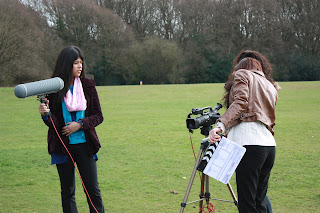
I felt the first day of filming went reasonably well. After solving our problems with actors we then began filming scenes 1 and 2. The organisational side of the first scene went really well we made sure we had exactly what we needed to do in our mind and refreshed ourselves with what happens and what shots we need for this scene. When it came to filming I felt we were very organised and when asked actors said they knew exactly what they needed to do. When we watched it back we saw that our first day of shooting was almost like an experiment as we had never used this camera before however we wanted to use this camera because it gave a higher quality and was far more advanced compared to the one we had used before. On the first day of filming we also had trouble with the microphone as it kept blocking out sound, this is the moment when we saw how sensative the microphone was and how the member of our team on this job role had to be very careful at all times. We also had slight trouble with our framing in scene 1 causing us to go back and re-film. I learnt from this as before we went back out to film I did some research into what the framing should look like. I found the link to the video below very helpful when looking at the framing of characters:
Framing for people
This link would then help me when it came to filming the rest of my short film.
Day 2 of filming
By the next day of filming we had reflected on what we had struggled on in the last day and had this is in mind when filming on day 2. We chose to film scene 9 and then scene 6 on day 2 as we had this fresh in our minds and knew exactly what we wanted from our actors. Scene 9 went especially well, although this scene is very short we found it went really well, we improved on the sound as we didn't have such microphone issues and our framing was a lot more improved on. Therefore overall I felt that the filming of scene 9 went well. Scene 6 however proved more difficult after we had to change location. The first location we shot at proved to be difficult as we were close to a major road, this meant we had a lot of unneccessary background noise not only from passing cars but also from the local residents as we filmed just after school had finished. Therefore we then made the professional decision to move location, to somewhere more remote. The new location we filmed in was a lot better. It was very quiet and we wanted the location to reflect the fact the characters were alone and this definately did.
Day 3 of filming
After filming twice already we were confident in filming the next scene, which was scenes 4 and 7. Before going out to film these two scenes we were very jubious because we had lots of extras to cast for a football match. We had also planned the shots we wanted for filming however still couldn't imagine it visually and therefore felt we were not prepared. This meant we decided before we went out to film we needed to do some research. This meant we searched on YouTube to find how football scenes have been shot and this Kes was the most helpful.
This then made us feel more confident as we all not only had the written and technical parts to this scene in our heads but also the visual side as well. When it came to filming we struggled trying to organise a large number of extras. However we overcame this and decided to go for a naturalistic style and asked the actors to simply play a football match. While we gave our major actors more direction. This worked well and helped us to get some useful footage which looked natural and not staged. We also filmed scene 5 on this day, this was the fight scene and because of the extras we again was jubious because there was a lot more direction that needed to be given. This scene went reasonably well when filming we stuck to the shot list and made sure all actors and extras knew exactly what they needed to do. We got this scene done fairly quickly and I was particularly careful to make sure no one was hurt in the process.
Day 4 of filming
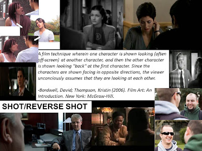
The last 2 scenes we filmed where scene 8 and 10. We started of with scene 8 which was a fairly simple scene to film compared to the scenes done before as we had no extras. The only problem we had was the lighting because we filmed on a bright day meaning there was unnecessary shadows caused on the character of Ashley. We also had trouble with the door to the changing rooms in both scenes using this location. This was because the door was quite heavy and made a loud noise when it slammed shut. This sometimes caused problems as the noise was prominently loud when the actors were speaking. This major problem lead us as a team and especially me as director to 'think on my toes' and think quickly meaning I then had to ask the actor to try and speak his lines after this disruption without it looking staged. Although this was difficult after a few takes of watcing it being acted out I felt that once we had made a few minor changes it finally worked and flowed. We then filmed scene 10, this was the main scene and the turning point and it was therefore important we got it right. Although this scene had very few shots we realised that our basic skills had almost 'been lost'. One of these was our shot reverse shot where our camera positioning was not quite right meaning when we came to re filming it needed to be right. To achieve the shot reverse shot we wanted I then did some research into what a shot reverse shot should look like.
This research then helped me when it came to going back and re- filming as I now knew what angle the camera should be at and how it should look. We also felt that we didn't like the way our film would finish as originally we had the camera tilt up towards the sky however when we tried to film this it didn't feel right so we decided to look at some editing techniques to see what we felt looked best to conclude our short film.

After reviewing everything that had been filmed and due to time issues as a group we decided to cut scene 3. Overall we felt that it didn't really have any significant importance to our film and wasn't an essential scene. For this reason and because of time pressures and trouble with actors we therefore made the decision to cut this scene.
Scene's needing re-filming
The scenes that needed re-filming were scenes 1 and 10 for reasons explained above. I felt that when it came to re-filming them it went a lot better.The main reason for this is because of my independant research where I looked at how it should be filmed and how it would look visually. When re filming scene 1 the framing was a lot better and a lot more improved and we also changed location to another toilet in the school. This cut out a lot of the sound issues and gave us a lot more space to position the camera. The second scene we re-filmed was scene 10. This was because the camera angle was wrong on the shot/reverse shot. We asked the teacher to look at this sequence as well and she gave us tips on how it needed to be changed which we did with great succession.

Monday, 26 March 2012

Post 15

Ancillary Task 2 - Film Reviews

Before beginning to write my film review, similar to my postcard I researched into the different types of film review to see the format of which my review needs to be written in as well as the style of writing that needs to be used.

My research on the film reviews
Screen International
Total Film

Sight and Sound

Similarities between the three above film reviews

Monday, 27 February 2012

Post 14

Ancillary Task 1 - Postcards
One of the independent study tasks set in the process of making our short film was to design a film poster or postcard. To begin with I analysed the conventions of a film poster. Here is an example made up film poster I have drawn to show the conventions that are typically seen:

After looking at the main basic conventions of a film poster. I then analysed some professional film posters concentrating specifically on the comparisons and differences between british film posters compared to ones advertising a film from the USA.
Why short films might find it hard to market their film using this strategy and why we might use postcards.
Most high budget films use posters as a way of advertising their film however our task is to make a short film on a very low budget making it more suitable for us to make a postcard. Marketing a film is an expensive strategy for a short film on a low budget meaning that advertising your short film is hard to make it successful. Short films also prefer to use postcards as they are cheaper to make as they are smaller but are also easier to distrube. This is either done by handing them out or they have space on the back for an address which means the audience can send them to their friends who can recommend your short film to others. Taking this into consideration I feel that the best option when marketing my film is to use postcards rather than posters. Although posters and postcards do have very similar conventions we have also chosen to make postcards because the space for the address can be used to target potential employers and funders to support any further work done.Therefore postcards have the ability to specifically target their audience of short film enthusiasts and those looking for new talent.

My analysis of postcards
Postcards are the most common marketing strategy when looking at the making a short film. After looking at a variety of postcards I can see that the conventions are very diverse.

The postcard for the short film 'On a Life's Edge' begins with a very short summary of what happens in the film, the details of all the production comapny and their logo as well as the duration of the film. This information given is needed for a postcard this is because when they are distributed at a film festival, the audience are immidetely given the chance to work out what the film is about and if they wanted to go and see it they will know exactly when and where to go. On the front of the postcard we are given an image of the setting of the film this helps the audience to identify the mood and the tone of the film and almost give a hint of what might happen in the film. This postcard gives editors and distributors a chance to analyse and review the film. Postcards are a simple way of advertisement and as well as being easier to make they are also easier to distribute and hand out. Postcard designs tend to vary meaning we have to analyse conventions because there is no strict guidlines to making a postcards this is because the information in them tends to be up to the producers and can therefore vary.


Another postcard I studied and analysed is 'Divine', the front of this postcard is an image from the film showing four young girls. This postcard is very similar to the one above in the fact that it includes the name of the distributors as well as the production company and their details. 'Divine also has a slogan of 'Let's go to church', this catch line works to give the audience an insight to the overall concept of the film but doesn't give anything away and helps the audience to remember the film in just one line. The name of this short film at the top and the colour scheme of the white lettering and clothes against the black background creates a sense of mystery but also an eerie atmosphere that in some respects engages the audience.

Conventions of film postcards
After looking at both film posters and postcards we decided that it was best if we promoted and distributed our film using a postcard, this is because we are making a short film. I am going to analyse some film postcards to see what the conventions might be. I am going to look at the front and back as this is what I will be creating. I will then be able to draw conclusions to see what I may include in my film postcards.

The first film postcard I analysed is On a Life's Edge, the front of the postcard has an establishing shot of a location which as an audience we assume is from the film and is an iconic location. The building on the front of the postcard sticks to the rule of thirds and the colour has been toned down to give it a brown sort of colour rather than just black and white making this postcard different and unique. This colour could be used for effect, however it could also have a significant link to the film and the characters and sets the overall mode and tone to the film. The title of the film is located at the bottom right of the page in white with a grey outline and the production name 'Carlton' at the top left, this postcard as kept everything a secret and not given away any twist. The back of the postcard is used to display the information rather than the front. The features on the back include the title, synopsis, cast and crew list, duration of the film and companies that have helped. This gives the audience a lot of information to take in before even watching the film and helps them to decide whether its something they would want to watch.

The second film postcard I looked at to see the types of conventions they use was 'The Hero's Journey', instead of having a few photos included within the film there is a dominating picture that is also the background for the postcard and this image introduces the audience to the main character of the short film and starts hinting towards the plot. The reason that this postcard could use characters as it's image is because this could be a more character lead plot rather than a plot based concept. The worn away edges add authenticity and make the postcard look much more professional. The font of the title reflects the genre of an action film, however the image on the front does suggest that its more 'fun'. The postcard also has a slogan similar to a film poster 'Enemies in the base, enimies in the base!' this could hint towards the plot and lead the audience into wanting to know more. The back of the postcard is very plain with a white background with a lot of space to write any details, there is an image from the film in place of the stamp and at the bottom there are logos from production companies.

My Initial Ideas for my postcard
My Postcard Designs

Image ideas for my postcard


Justification for why I designed them

Feedback on my postcard designs


Post 13

Pre-production Documentation

Key -       contribution to task
Summary
Initial idea thought up by me and Sade written by Casey
James, a young man still at school is at a crossroads. Unsure of his sexuality and with a girlfriend, he finds himself torn between what he knows and what he might know. James has a girlfriend, Roxanne, but he is one of the lads, he plays football and is accepted in his peer group. James has to decide which path he wants to take and a series of scenarios traces his journey.
Stylistic Influences
Written by Casey
Our short film has been influenced by the style of Jean-Luke Goddard and the French New Wave; we will experiment with camera, sound and editing.

The film will be visually enhanced by French New Wave style cinematography, sound and lighting, including the use of dropping sound. All of the symbolism of James’ homosexuality will be extremely subtle; as the idea is that the audience will not discover he is gay until the final scene.
The film will open with an establishing shot of the protagonist, James, standing in the toilets. There will be a close up of his face, to show his expression, before showing a close up of his mobile phone screen, reading, “keep it to yourself” from the recipient ‘Ashley.’
James then walks out of the toilets to find his girlfriend, Roxanne, waiting for him on the stairs. She excitedly stands up and holds his hand, while he doesn’t appear to be all that bothered. The camera will show a medium shot of them from behind, walking out of the doors together.
Throughout the piece, the audience does not know the name of James’ girlfriend (Roxanne); they are intended to assume that her name is ‘Ashley.’
As they walk out of the building, James and Roxanne are surrounded by a group of ‘lads,’ James’ masculine friends, talking to him about football. The sound will be dropped in and out in the style of Jean-Luke Goddard to symbolize James trying to block them out, block out the masculinity.
The film will then cut to a short scene of James in goal, whilst playing football. At this point, he is content, and focused on the ball. Roxanne is dressed in pink clothing, waiting for him next to the pitch. After the game, James and Roxanne walk off together. They are walking through the school together talking, when shouting can be heard. James looks round to see Ashley being brutally beaten up by the ‘lads,’ who are shouting homophobic abuse at him. There are different shots of James, showing his extremely concerned expression, and loosening the grip of Roxanne’s hand. Roxanne pulls James away, grasping his full attention, and takes him towards a bench.

An establishing shot shows the audience that James and Roxanne are alone. Roxanne wants to kiss James now that they are alone, and so moves onto him. James is shown to be somewhat uncomfortable with this, but awkwardly kisses her anyway.
The film cuts to show James in goal, taking part in another football game, only this time, he is somewhat more distracted. The camera subtly shows James focusing on the players, instead of the ball. The film cuts to the next scene to show James walking out of the changing rooms, having subtly removed his masculine football shirt, and replaced it with a pink polo shirt, when both Ashley and Roxanne approach from different directions. Tense expressions are exchanged, and in the style of Francois Truffaut we will freeze frame the character’s faces, just for a split second to emphasize them. Ashley then walks away as James completely ignores him, and focuses on Roxanne. Once Ashley is out of sight, he then quickly says that he has to leave, and also walks away. As he leaves, Roxanne shouts to him, “I’ll see you later anyway” and James just nods his head. The ‘lads’ who are also around the changing rooms here this, and shout, “oi, oi!” James doesn’t respond, and walks away, embarrassed.
The film cuts to a close up shot of James walking alone, showing his confused and upset expression. He receives another text from ‘Ashley’ reading, “Come and see me later.” James then kicks some pink flowers at the side of the road out of frustration, and petals go everywhere.
A close up shot of a couple’s hands held together is shown with intimate lighting. It is clear that the people who these hands belong to are in a bedroom. Dialogue of James’ voice is heard over this shot, as he says, “I know I’ve done the right thing, Ashley.” The camera will then cut to a 3/4 two-shot to reveal that the two people holding hands are actually James and a male Ashley, revealing that James is gay.
All of the symbolism of James’ homosexuality will be extremely subtle; as the idea is that the audience will not discover he is gay until the final scene.

Script
Originally written by Casey and me and then developed by Fatima and me


Storyboard
Made and put together by all members of the group


Shot list
List of shots thought of by me and Fatima and written by me
LOCATION
SCENE NO
SHOT NO
DESCRIPTION
INT – boy’s toilets
1
1
Establishing shot of the room with James from behind shaking his hands, wiping them down his trousers and pulling out his phone.
2
CU of James’ expression with the text message displayed across the screen.
INT – outside the toilets
2
1
Establishing shot with Roxanne sitting on the stairs waiting.
2
¾ shot of Roxanne sitting on the stairs still waiting
3
LS of Roxanne sitting on the stairs as James walks out of the toilets to meet her
4
Shot of James and Roxanne meeting and walking off. Shot/reverse shot with dialogue. Camera pans to the left.
5
LS of Roxanne bumping into a young child and him dropping his books.
6
CU of James’ reaction to Roxanne’s actions
7
LS of James helping the child to pick up the books and standing back up.
8
Cu of James’ reaction smiling.
9
James and Roxanne walk out of the doors together, child walks off in the opposite direction.
EXT – Walking through the school
3
1
LS of James and Roxanne as they walk out of the doors to be greeted by John and his friends.
2
Two shot of James and John exchanging dialogue.
3
Over the shoulder shot from John camera facing James .
4
Over the shoulder shot from James camera facing John.
5
Sot of boy 1 moving in closing to Roxanne and her then snuggling into James.
6
MLS of James exchanging dialogue with John over boy x’s shoulder.
7
Shot over James’ shoulder, panning Ashley’s movement.
8
MLS of James and John exchanging dialogue over boy x’s shoulder.
EXT – Football pitch
4
1
MCU of James in goal
2
Establishing shot of the pitch showing all the players at the other end.
3
MCU of James in goal
EXT – Outside changing room
5
1
¾ shot of James coming out of the changing rooms to meet Roxanne
2
MCU of James’ reaction
3
¾ shot of James and Roxanne walking along camera pans along with them.
4
LS behind James’ shoulder of Ashley being pushed into view by John and then the boys gathering around.
5
MCU of James looking concerned
6
CU of James loosening the grip of Roxanne’s hand
7
MCU of James looking ashamed
8
CU of John shouting abuse at Ashley
9
CU of football player 1 shouting abuse
10
CU of football player 2 shouting abuse
11
MCU of John shouting abuse and kicking Ashley
12
MCU of football player 3 and John shouting abuse
13
LS over football player 2’s shoulder of James being dragged away by Roxanne
EXT – On a bench
6
1
LS of James and Roxanne approaching a bench
2
Two-shot of James and Roxanne sitting on the bench
3
Over the shoulder shot of Roxanne speaking
4
Over the shoulder shot of James speaking
5
Over the shoulder shot of Roxanne speaking
6
Over the shoulder shot of James speaking
7
Two shot of James and Roxanne on the bench
EXT – Football pitch
7
1
ECU of James with no sound
2
MCU of players feet with the ball (sound re-enters)
3
CU of James with no sound
4
MCU of players feet with the ball (sound re-enters)
5
CU of James with no sound
6
CU of players feet (sound re-enters)
7
CU of James with no sound
8
MLS of striker scoring
9
¾ shot of John’s angry reaction
EXT – Outside the changing rooms
8
1
Two shot of James and Roxanne by the changing rooms
2
MCU of James looking disappointed and confused in himself.
3
¾ shot of Ashley walking towards the camera
4
MCU of James delivering dialogue
5
¾ shot of Ashley walking away and out of shot
6
MCU of Roxanne exchanging dialogue
7
¾ shot of James replying and walking away and out of shot
8
¾ shot of Roxanne shouting to James
EXT – School car park
9
1
LS of James sitting on the railings playing on his phone
2
¾ shot as a text comes through which will read across the screen
3
MLS as James replies to the text
4
LS as a car pulls up and James gets in
EXT – Archway
10
1
CU of James and Ashley’s hands held
2
Two-shot of James and Ashley
3
¾ shot of James speaking
4
¾ reverse shot of Ashley’s reaction
5
LS from James and Ashley from the front which will then pan up to a shot of the sky where the credits will roll

Shooting Schedule

Production Design
Written and made by Casey

Location Reece
Pictures and text taken and put together by me and Sade

Technical Reece
Drawn and created by me and Fatima
Equipment List
Created by me

Cast Details
Props/Costume List
Created by Fatima

Scene

Props

Cast/
Crew

Costume/Hair and make up


Location

Lighting

Responsibility

1
-Phone
-JAMES

-CASEY
-KELLY
-SADE
-FATHEMA
-School Bag
-Trousers
-Shirt
-Jacket/Coat
-Shoes
-Flat yet messy hair.
INTERIOR – TOILETS – MORNING
- Camera light [If needed]
-Turn on light switches if needed.
- It’s the group’s responsibility to ensure that the location and props are available. Or if the lighting is needed or not and if it is in working order.
- It’s the characters responsibility to ensure that their costumes are available during filming.  


2

-Books
-ROXANNE

-CASEY
-KELLY
-SADE
-FATHEMA
-Dress
-Coat/Cardigan
-Top
-Shoes
-School Bag
-Hair down (straight) with excess make up.

INTERIOR – HALLYWAY – MORING
- Camera light [If needed]
-Turn on light switches if needed.
-JAMES

-CASEY
-KELLY
-SADE
-FATHEMA
-School Bag
-Trousers
-Shirt
-Jacket/Coat
-Shoes
-Flat yet messy hair.
-YOUNG BOY

-CASEY
-KELLY
-SADE
-FATHEMA
-Non-uniform yet smartly dressed
-School Bag
-Flat hair

3

N/A
-JAMES

-CASEY
-KELLY
-SADE
-FATHEMA
-School Bag
-Trousers
-Shirt
-Jacket/Coat
-Shoes
-Flat yet messy hair.

EXTERIOR – WALKWAY - MORNING

- Natural lighting.
- Camera light [If needed]
-ROXANNE

-CASEY
-KELLY
-SADE
-FATHEMA
-Dress
-Coat/Cardigan
-Top
-Shoes
-School Bag
-Hair down (straight) with excess make up.
-JOHN

-CASEY
-KELLY
-SADE
-FATHEMA
-Non-Uniform yet smartly dressed
-School Bag
-Messy hairstyle
-EXTRA’S

-CASEY
-KELLY
-SADE
-FATHEMA
-Non-Uniform yet -smartly dressed
-School Bag
-Messy hairstyle


4

-Ball
-Goal Post
-JAMES

-CASEY
-KELLY
-SADE
-FATHEMA

-Football Shirt
-Shorts
-Socks
-Trainers
-Flat yet messy hair.

EXTERIOR – FOOTBALL PITCH – AFTERNOON

- Natural lighting.
- Camera light [If needed]
-EXTRA’S

-CASEY
-KELLY
-SADE
-FATHEMA
-Football outfit
-Messy hair style


5

N/A
-JAMES

-CASEY
-KELLY
-SADE
-FATHEMA
-Football Shirt
-Shorts
-Socks
-Trainers
-Flat yet messy hair.

EXTERIOR – WALKWAY – AFTERNOON

- Natural lighting.
- Camera light [If needed]
-ROXANNE

-CASEY
-KELLY
-SADE
-FATHEMA
-Dress
-Coat/Cardigan
-Top
-Shoes
-School Bag
-Hair down (straight) with excess make up.
-ASHLEY

-CASEY
-KELLY
-SADE
-FATHEMA
-Trousers
-Shirt/Top
-Jacket
-School Bag
-Shoes
-Flat hairstyle
-JOHN

-CASEY
-KELLY
-SADE
-FATHEMA
-Football Shirt
-Shorts
-Socks
-Trainers
-Messy hairstyle
-EXTRA’S

-CASEY
-KELLY
-SADE
-FATHEMA
-Football Shirt
-Shorts
-Socks
-Trainers
-Messy hairstyle

6

-Bench
-JAMES

-CASEY
-KELLY
-SADE
-FATHEMA
-Football Shirt
-Shorts
-Socks
-Trainers
-Flat yet messy hair.

EXTERIOR – BENCH – AFTERNOON

- Natural lighting.
- Camera light [If needed]
-ROXANNE

-CASEY
-KELLY
-SADE
-FATHEMA
-Dress
-Coat/Cardigan
-Top
-Shoes
-School Bag
-Hair down (straight) with excess make up.

7

-Ball
-Goal Post
-JAMES

-CASEY
-KELLY
-SADE
-FATHEMA
-Football Shirt
-Shorts
-Socks
-Trainers
-Flat yet messy hair.

EXTERIOR – FOOTBALL PITCH – MORNING

- Natural lighting.
- Camera light [If needed]
-EXTRA’S

-CASEY
-KELLY
-SADE
-FATHEMA
-Football outfit
-Messy hairstyle

8

N/A
-JAMES

-CASEY
-KELLY
-SADE
-FATHEMA
-School Bag
-Trousers
-Shirt
-Jacket/Coat
-Shoes
-Flat yet messy hair.


EXTERIOR – OUTSIDE CHANGING ROOMS – AFTERNOON


- Natural lighting.
- Camera light [If needed]
-ROXANNE

-CASEY
-KELLY
-SADE
-FATHEMA
-Dress
-Coat/Cardigan
-Top
-Shoes
-School Bag
-Hair down (straight) with excess make up.
-ASHLEY

-CASEY
-KELLY
-SADE
-FATHEMA
-Trousers
-Shirt/Top
-Jacket
-School Bag
-Shoes
-Flat hairstyle

9

-Phone
 
-JAMES

-CASEY
-KELLY
-SADE
-FATHEMA
-School Bag
-Trousers
-Shirt
-Jacket/Coat
-Shoes
-Flat yet messy hair.

EXTERIOR – CAR PARK – AFTERNOON

- Natural lighting
- Camera light [If needed]


10

N/a
-JAMES

-CASEY
-KELLY
-SADE
-FATHEMA
-School Bag
-Trousers
-Shirt
-Jacket/Coat
-Shoes
-Flat yet messy hair.

EXTERIOR – CROSS COUNTRY ARCHWAY – EARLY EVENING

-Natural lighting.
- Camera light [If needed]
-ASHLEY

-CASEY
-KELLY
-SADE
-FATHEMA
-Trousers
-Shirt/Top
-Jacket
-School Bag
-Shoes
Flat hairstyle

Health and Safety
Created by Sade and put into a table format by me
<><><><><><>
HEALTH AND SAFETY
Location
Hazard
6th form boys toilets
·   There is the issue of someone falling over electricity cables,
·   The possibility of the floor being wet, and someone slipping
·   The large amount of people being within the room may cause collisions
·  The possibility of tripping over wires of power cables used for lighting
Downstairs science corridor
·   Other people may drift into our shot (close area off
·   The possibility of tripping over wires of power cables used for lighting
·   Possibility of Roxanne falling down the stairs
·   Possibility of James hurting himself when coming out the door
Outside 6th form-by P.E. area
·   The possibility of rain-which can sabotage filming and effect electrical camera equipment- could cause electric shocks
·   The possibility of mud being on the floor-and causing film crew and cast to fall over
·   The possibility of film and cast members falling over and hurting heads on concrete
·   The possibility of ‘Ashley’ being kicked to hard- must ensure it is carefully acted out/he is protected by padding
·  Possibility of cars coming down the road
Common outside school
·   The possibility of the ground being wet- and film crew and cast slipping on mud
·   The possibility of rain-which can sabotage filming and effect electrical camera equipment- could cause electric shocks
·   Possibility of the bench being wet and slippery and causing ‘James’ and Roxanne to slip over
·   The possibility of ‘James’ and ‘Roxanne’ falling off bench and hitting head on concrete ledge

Football field in school
·   The possibility of the ground being wet- and film crew and cast slipping on mud
·   The possibility of rain-which can sabotage filming and effect electrical camera equipment- could cause electric shocks
·   Possibility of James and other cast members falling over when acting out football scene
·  Possibility of camera tripod falling in the mud
Cross-country opening
·   The possibility of the ground being wet- and film crew and cast slipping on mud
·   The possibility of rain-which can sabotage filming and effect electrical camera equipment- could cause electric shocks
·   Possibility of James falling in archway and into brambles
·  Possibility of cars coming down the pathway